Keeping our colours consistent helps our brand feel familiar, making it easier for everyone to connect with us.
LTL Yellow
#FDD440
RGB 254 213 0
CMYK 0 15 100 0
LTL Blue
#1070B6
RGB 0 110 185
CMYK 100 50 0 0
LTL Light Blue
#76A8D5
RGB 125 166 214
CMYK 50 25 0 0
Primary Colours
LTL colours have always been blue and yellow. This specific combination of colours is our identity that is recognized by many and sets us apart.
PRIMARY COLOURS
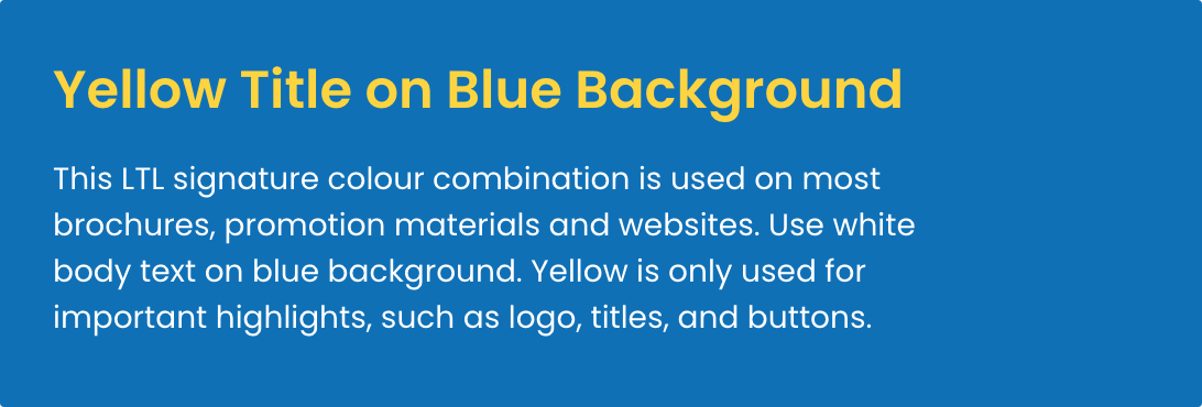
Text & Backgrounds
Use yellow as bright accent colour to call attention to logo, buttons, and to highlight important texts. Yellow should also be used for title colour on blue background.
Blue is the primary colour of LTL. Use blue as main background for both online and printed materials. Blue should also be used for title colour on white background.
Red
#C45A5C
RGB 196 90 92
CMYK 0 50 50 25
Orange
#FF9F1C
RGB 255 159 28
CMYK 0 40 90 0
LTL Yellow
#FDD440
RGB 254 213 0
CMYK 0 15 100 0
Green
#A7C957
RGB 167 201 87
CMYK 20 0 60 20
LTL Light Blue
#76A8D5
RGB 125 166 214
CMYK 50 25 0 0
LTL Blue
#1070B6
RGB 0 110 185
CMYK 100 50 0 0
Violet
#7E65C3
RGB 126 101 195
CMYK 35 50 0 25
Pink
#FF8FAB
RGB 204 230 254
CMYK 20 10 0 0
Secondary Colours
LTL yellow and blue are part of a complete colour harmony. We use a range of secondary colours to bring lively accents to illustrations.
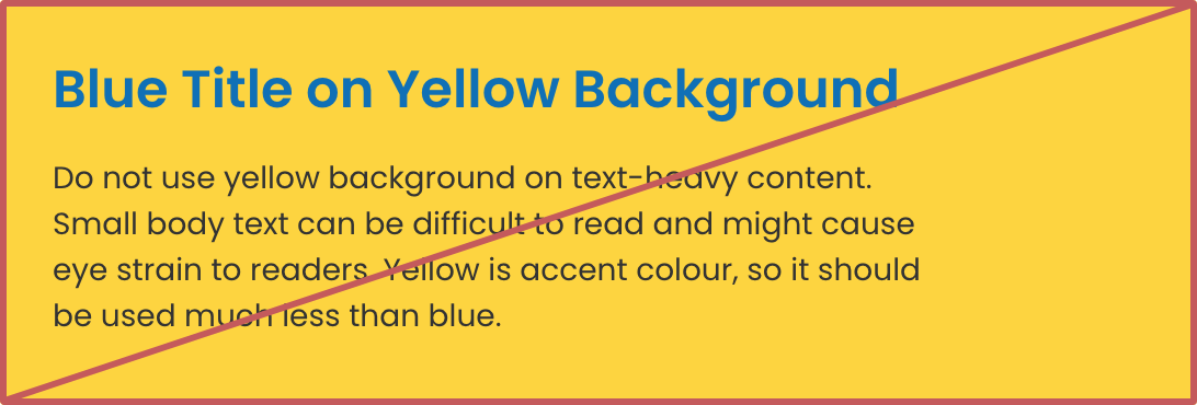
This is okay
This is better
SECONDARY COLOURS
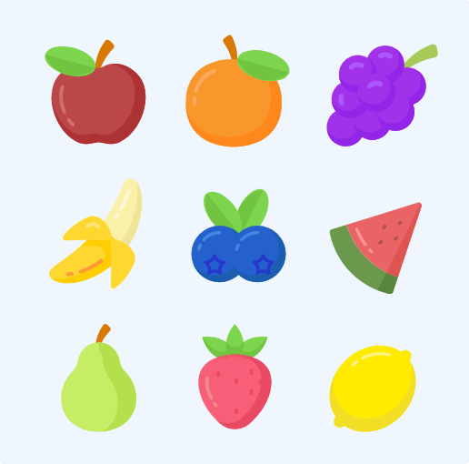
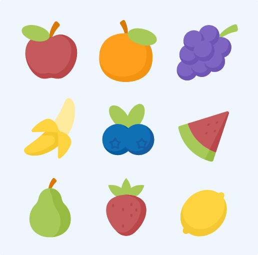
Illustrations
When creating learning materials or social media posts, make sure that your illustrations look consistent. Graphics from the third party sources may have too many different colours. This is where our secondary colours come in.
Black
#333333
RGB 51 51 51
CMYK 0 0 0 80
Dark Gray
#999999
RGB 153 153 153
CMYK 0 0 0 40
Light Gray
#F0F0F0
RGB 240 240 240
CMYK 0 0 0 6
White
#FFFFFF
RGB 255 255 255
CMYK 0 0 0 0
LTL Blue
#1070b6
RGB 0 110 185
CMYK 100 50 0 0
LTL Light Blue
#76A8D5
RGB 125 166 214
CMYK 50 25 0 0
Azure
#CCE6FE
RGB 204 230 254
CMYK 20 10 0 0
Snow
#EFF6FD
RGB 239 246 253
CMYK 6 3 0 0
Neutral Colours
Neutral colors are essential for adding structure and clarity, enhancing readability without overshadowing primary and secondary brand colors.
This website uses cookies to ensure you get the best experience on our website.

 Hi, my name is Mojca! I am from Slovenia and I work as a student advisor at our Shanghai school.