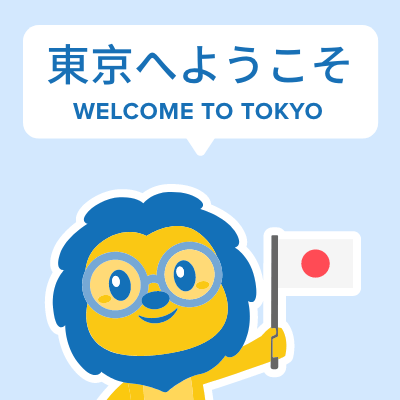

 Hi, my name is Manuel! I am from Spain and I am a Student Advisor at LTL. I’m now based at our Seoul School after living 3 years in Taipei.
 Hi, my name is Mojca! I am from Slovenia in Europe and I work as a student advisor at our Shanghai school.
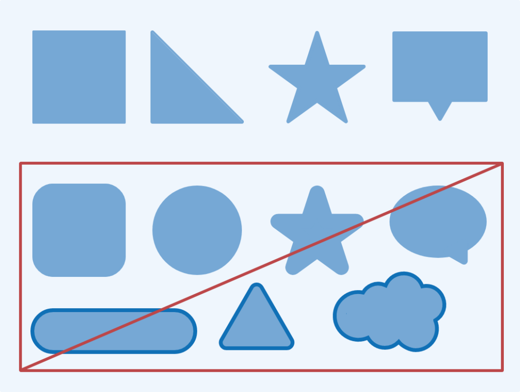
Shapes
The LTL logo is formed with skewed rectangles with pointy corners. Our shapes are firm and sharp. Use straight lines (horizontal, vertical, and diagonal) to cut shapes up as you need them.
Avoid using curves and rounded corners. Do not add outlines on shapes, icons, or text to maintain a simple and clean visual style.


Icons
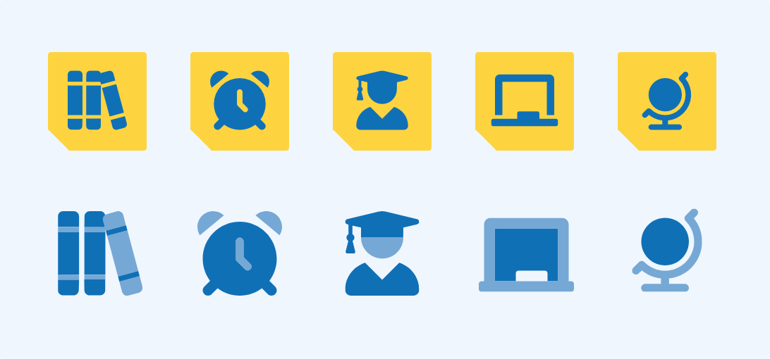
LTL uses bold monochrome icons, mostly without outlines. The icons should have a flat design with minimal depth and feature simple, easily recognizable shapes.
Icons can be utilized across the website and promotional materials to reflect our products and services.
ICONS
Variations
When using or designing icons, aim for a minimal color palette limited to our primary colors. You can put the blue icon inside a yellow square, or add light blue to make duotone icons.
LAYOUT
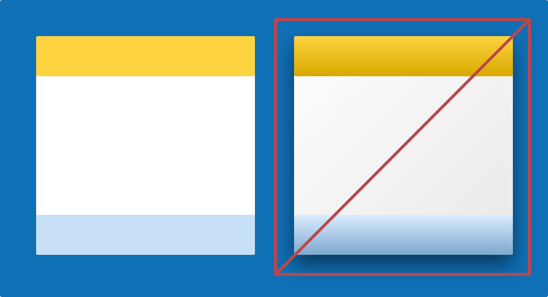
Depths
LTL brand identity embodies simplicity with a clean and flat design. To maintain a modern look, use shapes and colours without gradients, shadows, or effects.
LAYOUT
Spacing
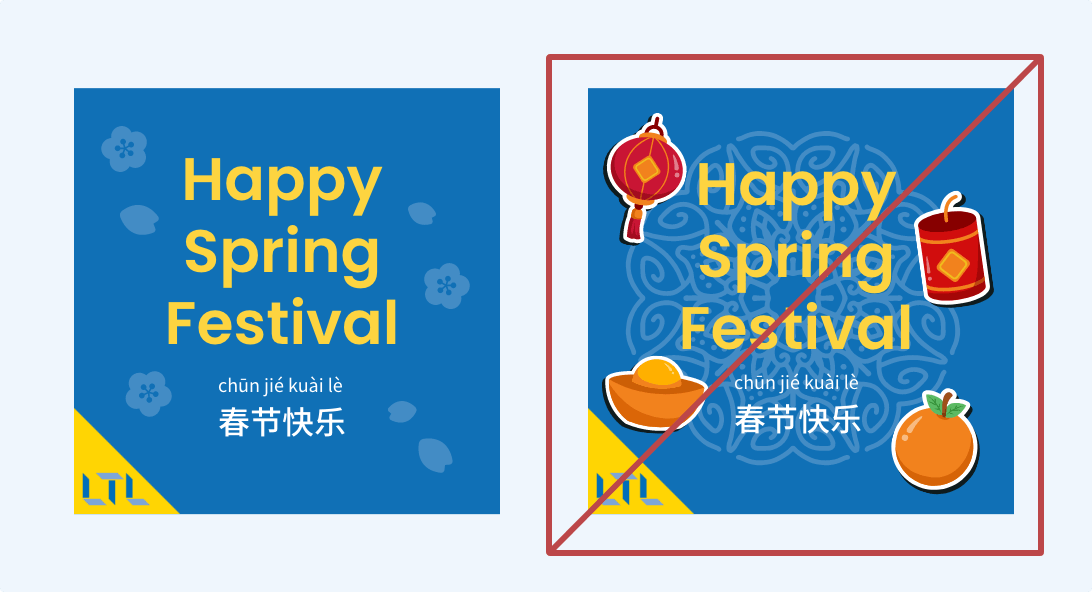
Resist the urge to fill every empty space—strategic whitespace enhances focus and clarity. If you need to add illustrations, make it subtle so that the main elements stand out.
LAYOUT
Tables
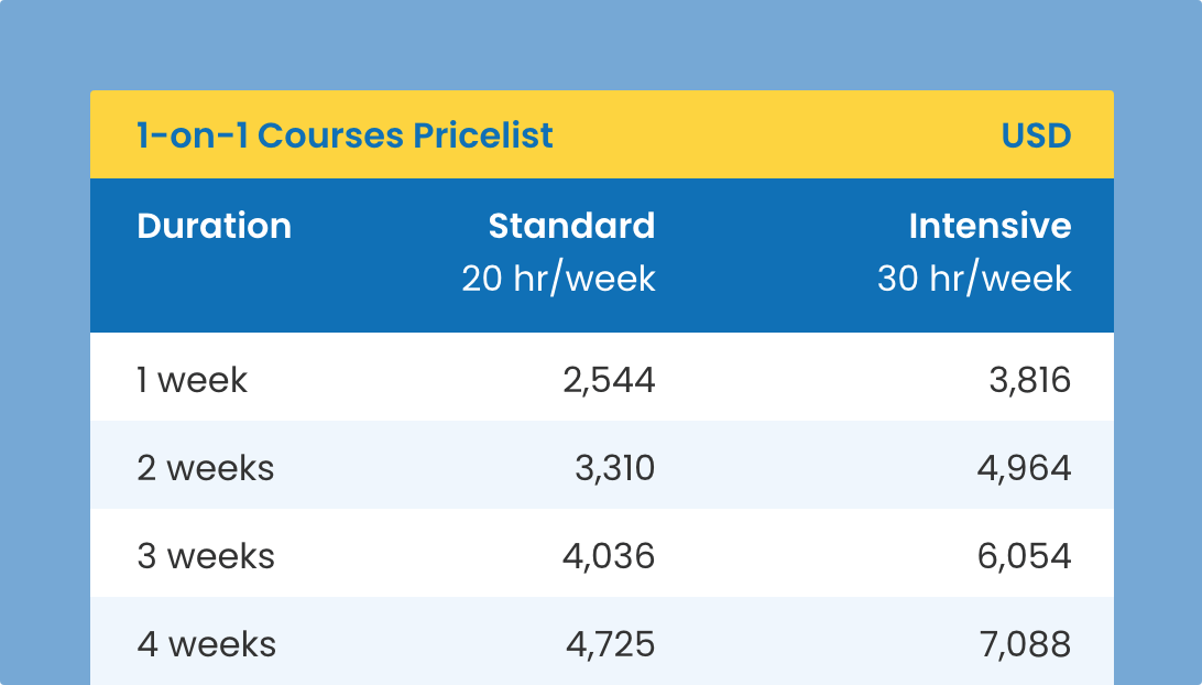
Certain information is best displayed in a table, such as a pricelist or new vocabularies. Use LTL Yellow and/or LTL Blue for table header, then use Snow #EFF6FD for in alternates. Avoid using traditional black border to maintain simple and modern look.