


 Hi, my name is Manuel! I am from Spain and I am a Student Advisor at LTL. I’m now based at our Seoul School after living 3 years in Taipei.
 Hi, my name is Mojca! I am from Slovenia in Europe and I work as a student advisor at our Shanghai school.
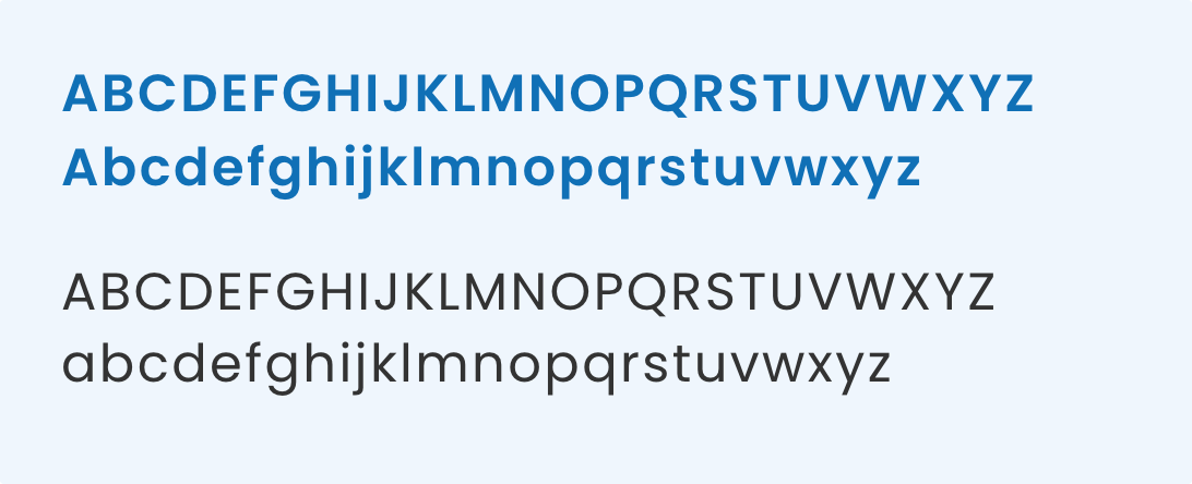
Font: Poppins
Poppins is a font that offers a modern, clean, and versatile typeface. Use Semibold for headings and use Regular for body text.
FONTS
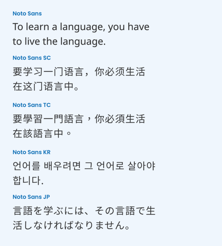
Noto Sans Family
Noto is a global font collection for writing in all modern and ancient languages. By using this font, we can look consistent across different languages.
Recommended to use in body text for learning materials such as textbooks, Powerpoint slides, flashcards, exercise sheets, social media posts, and more.
FONTS
Other Styles
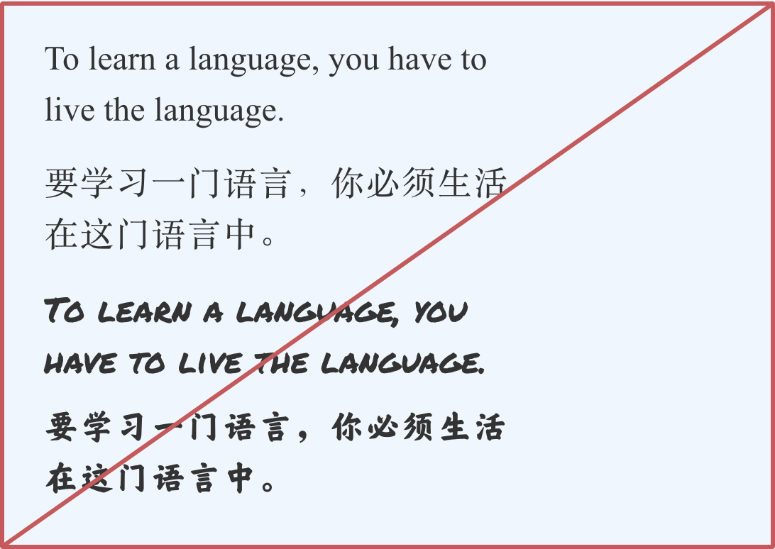
If you are unable to use those fonts mentioned above, simply use Arial or Helvetica, which may be included in your operating system.
Please do not use serif fonts, calligraphic fonts, or rounded fonts. They express different characteristics from the brand LTL is known for.
Sizes
To maintain a cohesive and professional look, avoid random text sizes. To ensure readability and clear visual hierarchy, headings should be at least twice as big as the body text.
In this example, the heading uses Semibold 32px, and the body text uses Regular 16px. Only use all caps when you want to shout out and get noticed.


SIZES
You should only use three to five font sizes across all posts, so that our Instagram account page looks consistent and professional. For example:
Heading 1 – 160 px
Heading 2 – 120 px
Heading 3 – 80 px
Body Text – 48 px
Use font sizes above when you are designing Instagram post (1080 x 1350 px). On some pages, Instagram posts are displayed small in 3 columns. Make sure that the main title is big and catchy.