

China World Map // Our Complete Guide to Why It Is Different
Everyone will probably be pretty familiar with the Western world map which has Europe and Africa at its centre, so when you first see a China world map, like the one below you may feel a little disorientated!
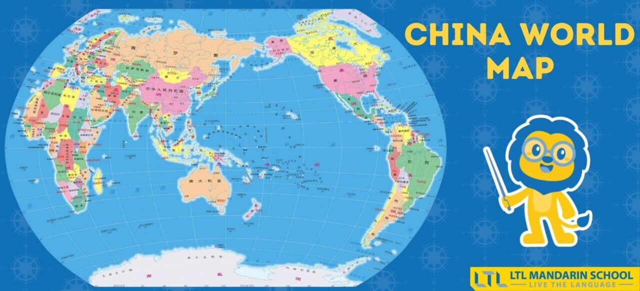
In the centre of the China world map instead of Europe and Africa being at the centre we have China and Asia as the main focal point.
So why does the China world map look different?
Well, that is what we’re going to be exploring today!
China World Map – Its History
China World Map – vs Western World Map
China World Map – Maps Today
China World Map – vs “Real” World Map
China World Map – China Looks Like a Rooster!?

China World Map – Its History
The name for China in Chinese literally translates to 中 (zhōng) “middle”, 国 (guó) “kingdom/country”.
This name dates back to around 1,000 BC and is said to have come from China thinking of themselves as the centre of the world.

If you look at China’s surrounding physical geography you can see where this idea came from.
With mountains, including the Himalayas, in the south west, the Gobi Desert to the north and the Pacific Ocean to the East China acting as natural barriers, China saw itself as an impenetrable kingdom at the centre of the world.
Historically China can also been seen as a centre of civilization, having the longest continuous civilization in the world, spanning 7,000 years.
In addition to this China is also home to multiple inventions including the four great inventions (四大发明 sì dà fāmíng):
- Papermaking
- The Compass
- Gun Powder
- Printing
Given this you can see why China could view themselves as being the centre of the world and why the China world map looks the way it does.
But where did the first China World Map come from?
The earliest known China World Map is the Kunyu World Map (坤舆万国全图 kūnyú wànguó quántú).
The name can be translated to “A Map of the Myriad Countries of the World”.
It was made in 1602 and was designed by Jesuit priest, Matteo Ricci in collaboration with Mandarin Zhong Wentao and technical translator Li Zhizao. The map was created at the request of the Wanli Emperor.

FUN FACT | Matteo Ricci was the first ever European to enter the Forbidden City in Beijing!
The Kunyu World Map was made in the style of European world maps, however with the key difference being that China was placed at the centre. It was the first map to combine Chinese and European cartography.
The map was crucial in expanding China’s knowledge of the world and actually revealed the existence of America to the Chinese. It was also exported abroad and became influential in Japan and Korea.
Compared to world maps today, the Kunyu World Map does have some distortions, but it is a good representation of the known geography at the time.
Since then the Chinese world map has of course become more accurate, but the general layout with China placed centrally instead of Europe has remained the same.


China World Map vs Western World Map
As we’ve already talked about, the key difference between the China world map and western world map is that China and Asia are placed much more centrally.
It isn’t at the very centre of the map as this is taken up by the huge Pacific Ocean, however China is definitely the focal point.
The map used in the west is the Mercator projection created in 1569 by Flemish geographer and cartographer Gerardus Mercator.
The map was called “A new and augmented description of Earth corrected for the use of sailors”. He created the map in order to aid navigation and it was unique for representing north as up and south as down everywhere.

Unsurprisingly the creator of the map, being a European, put Europe front and centre of the Mercator projection, much in the same way as China did for the Kunyu World Map.
Due to the impossibility of representing a 3D object on a 2D surface distortion occurred.
By then placing Europe so centrally it became much more inflated. Other areas that are also shown as much larger are North America, Greenland and Antarctica. This is because the further from the equator the bigger the distortion.
The Mercator projection has become the most commonly used map in most of the world, however due to its misrepresentation of scale, in recent times it has come under some heavy criticism.
Due to the inflation of both Europe and North America, the Mercator projection’s eurocentrism has been criticised for making these developed countries appear more prominent and important. Whereas underdeveloped, colonised areas such as South America, Africa and South East Asia appear much smaller in comparison to their actual size.
Critics have said this reinforces ideas of white superiority and builds on a world view rooted in colonialism.
In contrast to the Western world map, the Chinese version shrinks Europe down in size, so does this make it more accurate?
Let’s have a closer look at the China world map today to see.

94 Countries in Chinese 🌏 What Are Their Literal Translations?
Discover how to say 94 country names in Chinese and what the literal translations are. There are some funny ones!
China World Map – Maps Today
So what does the China world map actually look like today?
Below you can see the example of a modern day map which we saw earlier.
This is the map you’ll find hanging on millions of Chinese homes, being taught in classrooms and being sold across China.
As we already talked about, probably one of the first things you’ll notice when you see the China world map is how much smaller Europe looks compared to Western maps.
This is because, as we mentioned before, placing China more centrally changes the scale of distortion.

Another key difference is that on the Chinese version the Americas appear on the right, or east side of the map instead of the left or west side.
However, apart from its position on the map, the Americas don’t appear too different in size and shape than they do on a Western map.
So does putting China in a more central location, making Europe smaller, mean it’s a more accurate map?
The short answer is not really, both maps have heavy areas of distortion, it just the areas of distortion differ.
If both the China world map and Western world map are incorrect, what does a “real” world map look like? Read on to find out (the answer may surprise you!)
China World Map vs “Real” World Map
With the traditional Mercator projection maps coming under scrutiny for their eurocentrism there have been calls to stop using it and find a more accurate representation instead.
Just check out the graphic below to see how inaccurate it really is!

However, as we already mentioned earlier trying to accurately get a 3D shape represented as a 2D image is no easy task.
But, there have been some notable attempts that are beginning to be embraced instead of the Mercator projection.
So let’s have a look at some of the other alternatives and see how they compare to the Chinese world map.
Robinson Projection
Arthur H Robinson devised this map in 1963 with the goal of creating a world map that was both more accurate but also remained visually pleasing.
To do this the Robinson projection is neither equal-area or conformal, with a compromise between the two being reached instead.

From 1988 until 1998 this was the National Geographic Society recommended world map to be used. However, it is still used by many higher institutions today such as the European Centre for Disease Prevention and Control.
Winkel Tripel Projection
The Winkel Tripel projection was created in 1921 by German cartographer Oswald Winkel.
No, that isn’t a typo, tripel is German for triple and refers to Winkel’s aim to minimise three kinds of distortion: area, direction, and distance.

Like the Mercator projection Europe and Africa remain centrally located on the map, rather than Pacific focused like the China world map.
The map still has some distortion on the north and south poles, however it is seen as one of the most accurate maps to date.
In fact in 1998 the National Geographic Society announced that the Winkel Tripel was their preferred projection.
As previously mentioned this used to be the Robinson Projection. Since 1998 many schoolbooks and educational institutes have begun using the Winkel Tripel as their map of choice.

12 City Names in Chinese 😂 The Funniest Literal Translations
City Names in Chinese 😅 Funny Chinese Translations Ready for some hilarious city names in Chinese direct translations? Chinese to English translations sometimes make little to no sense! Although Chinese is an incredibly logical language to learn we can’t help…
Gall-Peters Projection
In 1973 German film maker Arno Peters presented a world map in direct opposition to the commonly used Mercator project.
Peters criticised the Mercator project for making underdeveloped countries look smaller which he stated made them seem less significant.
He instead created a map where all areas have the correct sizes relative to each other, it achieves this goal by distorting most shapes.
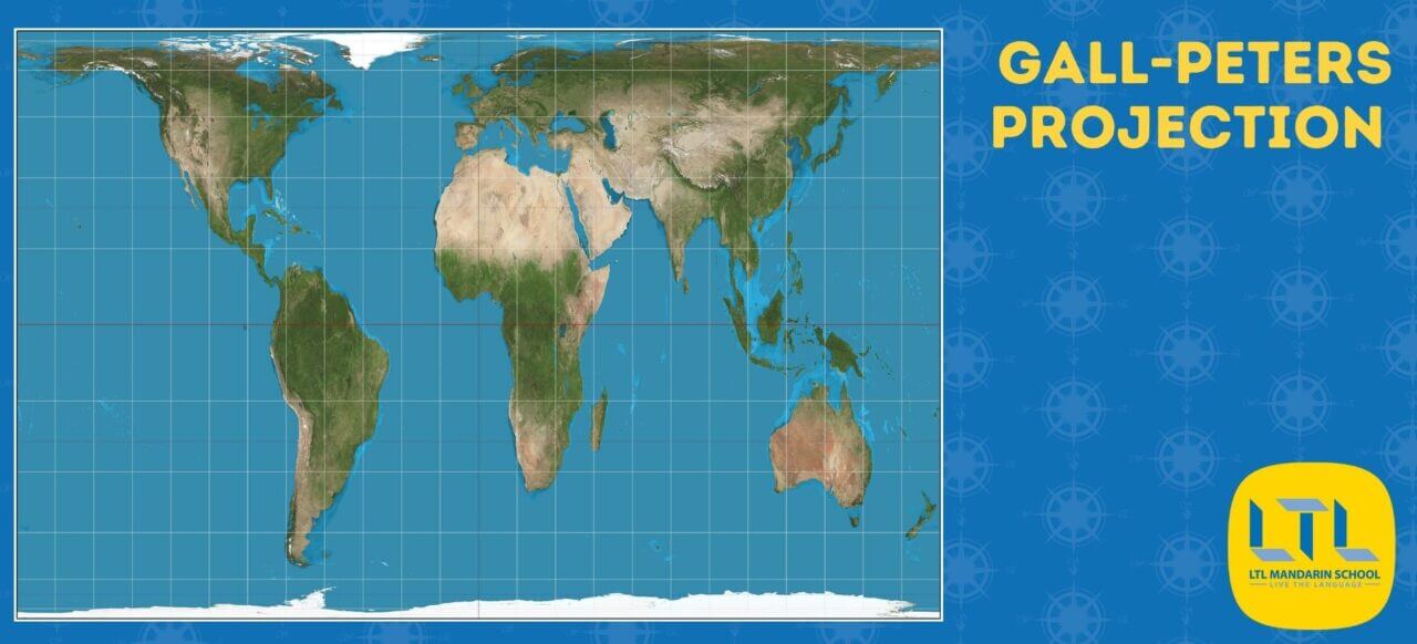
However, it turned out an exact map like this was already in existence, created by Scottish clergyman James Gall in 1855. This is why it has now been given the name Gall-Peters citing both creators.
This map is considered to be one of the best world maps and is promoted by the United Nations as well as socially concerned groups such as Oxfam, it is also widely used in British schools.
The Gall-Peters projection does have it flaws with certain places appearing stretched, horizontally near the poles and vertically near the Equator.
AuthaGraph Projection
In contrast to the previous three “real” world maps we looked at, we have one which is most similar to the China world map because it is centred on the Pacific Ocean.
The AuthaGraph projection was invented by Japanese architect Hajime Narukawa in 1999.
It is an approximately equal-area world map projection.
The general shapes of the continents are consistent with more familiar maps, however their orientation isn’t with the continents curving upwards on both sides.

The map was made by dividing the globe into 96 equal triangles, projecting them onto a tetrahedron and then unfolding it into a rectangle. Pretty smart right!
Well, some people definitely thought so because in October 2016, the AuthaGraph mapping projection won the 2016 Good Design Grand Award from the Japan Institute of Design Promotion.
As already mentioned, like the China world map, the AuthaGraph projection has China placed more centrally with Europe pushed off to the left side, taking a much less prominent place and appearing very small.
This is largely due to the historical influence of the Kunyu World Map which spread to Korea and Japan when it was first made. Most normal Japan world maps also have the Pacific Ocean as their centre.
There is still some inaccuracy with this map, however it’s viewed by many as being as close as you can get to an exact equal-area map.
Given this perhaps maps like the China world map that centre on the Pacific Ocean should be more common place?

China World Map – China Is a Rooster!?
Now after all that technical map talk we thought we’d end with a bit of fun! We’re going to have explore what is considered a well known fact within China, but is very much less well known elsewhere: China looks like a rooster (公鸡 gōngjī)!
Yes, you read that correctly, within China it is commonly known that the map of China resembles the shape of a rooster.
Not convinced? Just have a look at the image below!

Can you see it now?
In China children are taught from a young age that the map of China looks like a rooster.
This is actually a great visual and fun way to teach them about Chinese geography:
- The capital, Beijing, is at the throat of the rooster.
- Harbin is the eye.
- Shanghai is on the chest.
- Tibet and Xinjiang are the tail feathers.
- Hainan is its foot.
The rooster is one of the 12 Chinese zodiacs so it is quite an auspicious animal and the shape is viewed by some as having positive Feng Shui.
And that brings an end to our blog exploring the China world map, which map do you use in your home country?
Let us know in the comments below!
China World Map FAQs
Where is China on the world map?
On a Western world map China is located in the East, it is to the South East of Europe and North of Australia.
On a Chinese world map China is located just West of the centre.
What does China look like on a map?
It is commonly known within China that the shape of the country looks like a rooster.
Is there Google Maps in China?
There is Google Maps in China but you need a VPN to use it and it isn’t very accurate.
It’s better to use a Chinese map app such as Baidu Maps instead.
What is the Google Maps of China?
The Google Maps of China is Baidu Maps, Baidu is a Chinese search engine and can be thought of as the Chinese equivalent to Google.
Want more from LTL?
If you wish to hear more from LTL Mandarin School why not join our mailing list? We give plenty of handy information on learning Chinese, useful apps to learn the language and everything going on at our LTL schools!
Sign up below and become part of our ever-growing community!


2 comments
[…] hakkındaki düşüncelerinizi yorum kısmında paylaşabilirsiniz.Kaynaklar: 1, 2, 3, 4, 5, 6, 7, 8, […]
[…] You can share your thoughts on the subject in the comment section.resources: 1, 2, 3, 4, 5, 6, 7, 8, […]